See How This New York City Conquered the Market
by tourist

New York once had a powerful economic system, a huge upscale market for luxury goods, and a flourishing high culture based on philanthropists, museums, and universities. But all of that is changing.
A gush of development is transforming Manhattan’s West Side. Many New Yorkers are upset about it, but what exactly is happening?
Table of Contents
ToggleThe I NY Logo
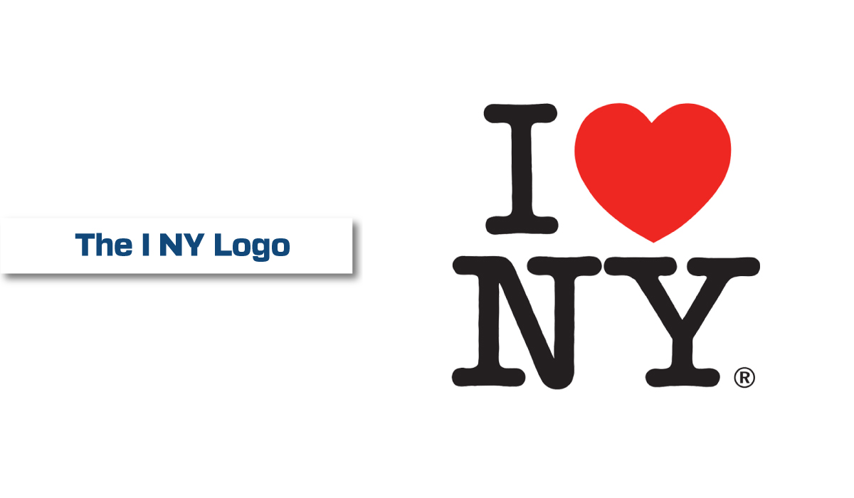
The I NY logo is a global symbol for the city of New York. It is seen on souvenirs, billboards and branded merchandise across the globe. It has become a part of New York culture, and it is an iconic image that represents hope and passion for the future. The design of the I NY logo is stunning, but what makes it so powerful is how it has changed perceptions and aligned people with New York’s spirit.
It all started in the mid-70s, when the I Love New York campaign was created to boost tourism and shine a positive light on the state as a whole. At the time, New York was in danger of bankruptcy and riddled with crime, poverty and a lack of hope. The campaign was meant to raise spirits and remind residents of the city’s beauty and history, and it was a huge success.
Famed graphic designer Milton Glaser drafted the logo with a red crayon on the back of an envelope (or napkin, depending on who you ask) while riding in the back of a taxi. It was originally used as a slogan for an advertising campaign, and it quickly became one of the most famous symbols in the world.
Glaser’s design was so successful that the campaign generated $30 million in official merchandise. This was a lot of money for the time, and it allowed the logo to go global. Today, the iconic symbol is used in cities and countries around the world, and it continues to be a symbol of the city’s beauty, hope and passion.
After the terrorist attacks of September 11, Glaser reimagined the simple logo with a more somber tone. He added a small, black spot to the heart, which was intended to symbolize the fallen towers. The updated design was a hit, and it helped bring in funds for charities that supported the city and its residents.
Although the new design received a great deal of praise, it did spark some criticism among designers. Adobe’s executive vice president of design Scott Belsky noted that the new version of the I Love New York logo would have Glaser “kerning in his grave,” while Futurism’s tagline editor Tag Hartman-Simkins argued that the new iteration was missing “anything that feels timeless or iconic.” Nevertheless, the new “We NYC” logo is still an impressive example of the power of creative marketing and effective branding.

The I NY Story
When New York’s most celebrated rebranding campaign launched in 1977, the city was at rock bottom. Unemployment was at an all-time high, residents felt the city was slipping away from them, and it was widely believed that New York’s days as a cherished global tourist destination were over.
Boss Tweed’s corrupt machinations had stripped the city of its soul, leaving behind a place that resembled “a mismanaged ant heap.” A deranged serial killer called Son of Sam roamed the streets. And while no one could deny that the city’s skyline was dazzling, it had become more about awe-inspiring glass and steel than its history, culture, and character.
In the wake of these events, the state legislature increased the city’s annual tourism budget by tenfold and the city’s leadership hatched a Hail Mary plan to restore its image. While several half-hearted marketing campaigns had been tried in the past—New York as Fun City and The Big Apple, among others—the city was desperate for something more substantial.
So, the nascent Department of Commerce bet the entire city’s budget on a full-scale rebranding effort. It hired two veterans of financial marketing—John Dyson and Bill Doyle—and gave them free rein to come up with a strategy that would be both audacious and expensive.
The resulting campaign was unlike anything the city had ever seen. It featured a simple logo that consisted of a heart, symbolizing love, followed by the word New York. The tagline, backed by a catchy jingle, captured the world’s imagination and reignited a shared affection for New York City that still exists today.
In an era when new skyscrapers are as common as parked cars, the I NY campaign symbolized a more authentic and traditional side of New York. The city’s iconic landmarks—including the Brooklyn Bridge, Central Park, and the Empire State Building—were featured prominently in the campaign. The city’s cultural institutions—including the Metropolitan Museum of Art and the American Folk Art Museum—were also included. And the city’s storied neighborhoods—including St. Marks Place and Greenwich Village—were highlighted as well.
But perhaps the most evocative element of the campaign was its use of typography. The I and the NY letters were set in a typeface named American Typewriter, which has an air of heritage and authenticity that can’t be ignored.
New York City’s History
New York City, a global center of finance, trade, and culture, has long been considered one of the world’s most exciting, vibrant, and diverse cities. The largest metropolitan area in the United States, it is home to more than 65 million people and is visited by nearly a third of all international tourists each year. Founded by Dutch settlers in 1624, the city has had a long history of innovation, from the earliest days when its main industry was agriculture and fur trading, to the Industrial Revolution that saw massive growth in factories and shipping.
The city’s renowned architects designed monumental buildings, and its citizens contributed to the city’s fabric through building and philanthropy. Even the infamous “robber barons” of nineteenth-century Tammany Hall were not completely evil: They paid their property taxes and spent huge sums on food, clothing, and luxury goods, creating jobs for small armies of domestics, vendors, and employees in every field.
During the Industrial Revolution, a steady stream of immigrants arrived from Europe, dramatically changing the city’s demographic. The immigration influx continued through the late 1800s, leading to the consolidation of the modern five-borough city in 1898 and bringing with it an economic boom and a population explosion.
In the twentieth century, the city renewed its stature as a cultural center and hosted the development of new music styles, while its publishing industries blossomed into national and international renown. Its economy diversified into service industries, and the city’s population grew exponentially.
Today, the city is still a vital financial hub and boasts an impressive array of museums and art galleries. It is also the home of countless Broadway shows, restaurants and shops. And it continues to attract immigrants from around the world.
But it is no longer as affordable as it once was. The vast majority of the city’s residents now rent apartments, with average condo and co-op prices in Manhattan topping $2 million for the first time last year. This is a new kind of New York, one where the working class is being priced out and replaced by outsiders—the wealthy who want to live like the rest of us.

The I NY Experience
Embark on an immersive journey into NYC’s art scene and design industry. Elevate your skills through personalized in-person or virtual training from renowned mentors. Gain hands-on experience and be eligible for a remote internship!
In 1977, New York City was in the midst of a crisis. The economy was faltering, crime was on the rise, and a growing number of tourists were leaving for other cities. The city recognized that it needed a fresh image to lure visitors back and kick-start a recovery.
One bright spot was the city’s thriving restaurant and nightlife scene. But the gloomy media coverage of crime and urban decay painted a nightmarish picture of the Big Apple to outsiders. Tourist guides told readers to clutch their purses tightly, engrave valuable items with special metallic pens, and stay within midtown Manhattan. They warned against wandering into the ramshackle outer boroughs and not to visit any area with a bad reputation.
In an attempt to combat the negative publicity, the city launched a rebranding campaign that featured an irresistibly simple visual symbol—a heart, representing love, followed by “NY.” The logo and catchy jingle quickly became synonymous with New York City. The campaign was an instant success and helped the city reclaim its global reputation as a cherished tourist destination.
A few years later, the city saw a modest recovery and began to attract a wider variety of visitors, including families with children. In addition to revitalizing the city’s image, the influx of visitors was beneficial for local businesses. But as New York’s population grew, so too did its poverty rate, and the city struggled to keep up with rising rents.
By the 1990s, New York’s crime rates had begun to drop, and the city had regained its position as a leading financial center. Neighborhood restoration projects helped bring life back to parts of the city that had been devastated by a decade of decline.
Today, New York City is grappling with a different type of economic problem. High rents are driving residents and businesses away, while many of the city’s largest apartment buildings sit empty. In response, the city has deregulated thousands of apartments, allowing landlords to raise prices at will.
New York once had a powerful economic system, a huge upscale market for luxury goods, and a flourishing high culture based on philanthropists, museums, and universities. But all of that is changing. A gush of development is transforming Manhattan’s West Side. Many New Yorkers are upset about it, but what exactly is happening? The I…
